525th Anniversary
Celebrating 525 years of higher education and research
UNIVERSITY OF ABERDEEN
No. 11753 | Brand
The Challenge
To raise the profile of the University of Aberdeen through a creative campaign for their 525th anniversary celebrations.
The Outcome
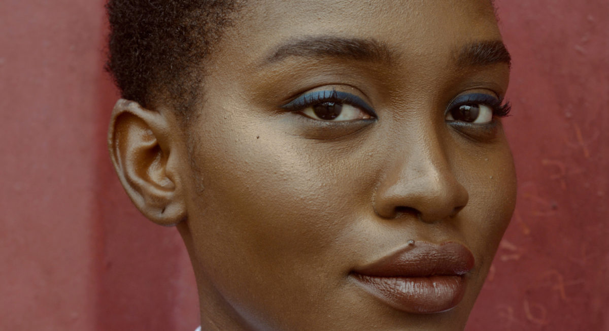
A coherent and polished design for a range of collateral, using curved lines inspired by architecture and vibrant photography.
A huge milestone
In 2020, the University of Aberdeen celebrated 525 years as Scotland’s third-oldest university. We were appointed to deliver a creative campaign to be used throughout their year of celebration across print and digital assets, including videos, online documents, outdoor banners and merchandise. Given the wide variety of applications, the final result had to deliver a consistent brand and narrative for every purpose. Messaging needed to speak to a range of audiences and inspire connections between alumni, partners, students and staff. The story wouldn’t end in Aberdeen either. It would include the University’s achievements in Qatar and raise its profile among regional and international networks. Building upon Aberdeen’s global connections, the campaign would drive forward the University’s esteemed past and innovative future.
Architecture-inspired design
Inspired by Sir Duncan Rice library’s internal architecture, we used curved lines to interact with imagery and provide visual interest on flat colour backgrounds. Applying colour gradients from the University’s palette to these lines created ‘waves’ of colour, giving imagery an added boost of vibrancy and energy while ensuring text legibility. The result is a highly distinct and unique look with great flexibility for adaptation and extension across all types of marketing materials.
Headline messaging was built around the concept ‘525 years of’, with the subsequent text changing to highlight different rich stories, impacts and achievements from the past. The anniversary logo appeared in white on all visuals and could be adapted to work with images and text, providing considerable scope for creative interpretation.

Liked what we did?
Give us a call and let’s talk about how we can take your campaign to the next level.


